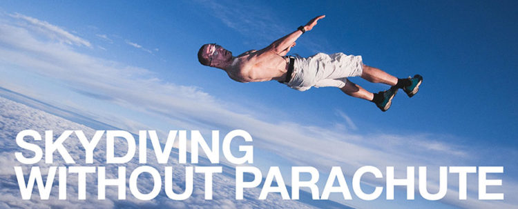
With over 200 jumps out of an airplane under my belt, I’ve always done it with a parachute. But when we flipped the switch and went live with this new site, it felt like I was Skydiving Without A Parachute.
What a wild ride.
No Regerts
I’m not one who spends much time wallowing in regret, but… holy shit! Kind of wish we would have done a few things differently when we launched the site. I will admit that at the end of a long development cycle, I just said, “Fuck it” and decided to go live. It was pretty jarring for everyone, but I think we’re finally getting to the point where we have reasonable stability and a chance to complete the bug fixes while also adding back some features of the old site.
So, here’s what we’re working on:
- Navigation continues to be buggy, especially in the FRESH section. Much of this is due to a technology called ‘caching’, which attempts to make the site faster by storing certain elements of a webpage on both our servers and your browser. Getting these disparate elements to touch and connect correctly creates a seamless user experience. When they don’t connect properly, you click PREVIOUS and get sent to some weird page you’ve never seen before. The challenge is that fine-tuning caching to get it to act like we want it to takes some time. This is our highest priority and could take a week or two to fully resolve.
- GIFs and MP4s need to autoload on single-snap posts. We’re creating and testing some solutions so you don’t have to click on the PLAY icon just to make the image load. We’ll be done with this soon.
- Improve the sidebar navigation. Users want us to go back to the same kind of sidebar navigation of the old site. If you’re in the FRESH section, the sidebar should act like it does now along with PREVIOUS and/or NEXT navigation buttons at the bottom so the user can control the experience. The same should happen for the FRONT PAGE. This will take a week or two to develop and deploy.
- Improve design. Users have noted that the site color and design seems bland. We’ll spruce it up and section things off so it is easier on the eyes. Mobile users would like us to go back to a dark background. We’ll explore that, but doing so creates the need maintain two designs (one for desktop users and one for mobile users). I’m not particularly excited about that. But I’m open…
- Site speed needs to increase. This will always be on our list. Getting caching right, adding another Content Delivery Network (CDN), making our code more efficient, and reducing image size are just a few of the projects we’re working on.
But wait, there’s more!
There are projects on the list which do not show up here. An example is to get our POPULAR 24 hours, 7 days, 30 days working again. Another is to create the ability for mobile users to zoom in on images. We’d also like to explore the possibility of adding a ‘Swipe right/left’ navigation for mobile users, but that will be down the road a bit.
Your input is really awesome! Moar, please.
Experiencing bugs or problems not on the list above? Got questions or have ideas for new features we should explore? Please leave your comments below. As always, a big thanks to everyone!
Published on: Aug 17, 2017
